
Audi has changed their famous logo so subtly that it might go unnoticed. No, it is not the number of rings, but their colors. The similar-looking rings, signifying each automaker that merged to form the brand Audi has changed after years. The design change might be subtle, but it has become the talk of the town or the world in Audi’s case.
2D Uniformity and Unique Texts
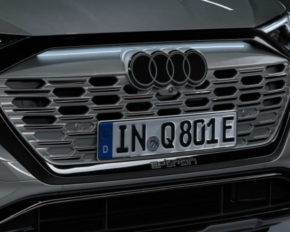
A good design is less design, and Audi proves that. Four rings might make up the Audi logo, but they are the most recognized rings in the world. The logo is now two-dimensional to make it look similar across all platforms. In a magazine, on a billboard, or on a car, the four-ringed logo is recognizable everywhere. To go with the uniform logo, Audi has come up with its own text style, which is aptly named Audi Type. This new identity will be laser etched onto the B-pillars of all its cars. In true German fashion, the luxury brand Audi isn’t into your face with the changes but subtly whispers it. The changes are like a facelift and not a complete transformation.
Colour, Colour, What Colour Is It?
The geometric circles of the logo remain the same, the colors not so much. The logo rings currently come in chrome but will soon be white with black borders. The color change is an informed move as the contrast factor makes the logo visible from afar. If anyone is looking for the current version of the logo, then they are in luck. Audi offers its customers the option of dark-colored emblems with the white part replaced with a dark gray that looks like gloss black.
It was 1965 when AU was rebranded as Audi, the year the rings on the logo came to be. The four rings have changed very little since then. It’s time for the logo to move from chrome to black and white with its own unique typeface.